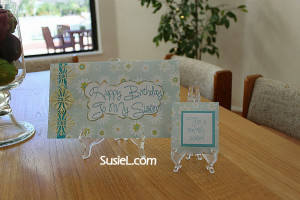
I’ve a sister who is not particularly fond of pinks & purples. So I selected a blueish/green digital print for the card & matching tea bag cover. I added some washi tape that I’d bought at Walgreens on a whim – I just wanted to buy some & didn’t find one I particularly liked, but I liked this the best of the bunch. It matched beautifully! Next came some pale yellow cuts from one of the new Anna Griffin Cuttlebug dies. As you may imagine, her dies are very intricate & a bit of a pain, in my opinion. It took quite a while to get the cut removed from the die & all the bits out. When I got done, the middle row was rather boogered up. So I decided to cut them apart & use the four good parts. (I adhered the fourth one on top of the middle one with a pop dot to give it some dimension.) I found some gems in my stash that again…matched beautifully! This card was shaping up to be one of my favorites! I then did a sentiment in Silhouette Studio Designer Edition, inked the edge with Tim Holtz antique linen & topped it off by spraying with some Perfect Pearls. Although I’m sending it to my sister, I’m not happy with the way the sentiment came out. So I’m going to make this card again & use a different way of adding the sentiment because I think this card has the potential to be a really beautiful card!
For the matching tea bag cover, I started with a tea bag graphic from the “Love You A Latte” collection at LetteringDelights.com. I massaged it in Silhouette Studio Designer Edition by adding cut lines, replacing the graphic with the digital paper I used in the card & added a sentiment. Even though it’s kind of corny, I liked the sentiment of “For A Tea-rrific sister” & enclosed a bag of Ambiance Orange Jasmine green tea.
The final step was making an envelope wrap for the address & return address. When I first saw these, I thought they were weird. But after I made my first one & put it on the envelope, it looked so nice that I was immediately sold on the idea. I see a lot of envelope wrappers in my future! I will post more information on them in a day or two, when I have more time.
I’m really loving the Simply Gorgeous font…most of the time. The capital T looks a lot like a G. So the sentiment on the front looks a lot like “Happy Birthday Go My Sister”. I guess it could be something worse! But as much as I love this font, I think I’m going to have to refrain from using it when I need a capital T.
- digital paper – from the Daisies Paper pack at JessicaSprague.com
- tea bag modified from a graphic in the “Love You A Latte” collection at LetteringDelights.com
- Anna Griffin Cuttlebug die – Flower Layer
- Scotch brand washi tape – Cracked
- font – Simply Gorgeous
- Xyron – used to adhere the three flowers on the front. As intricate as this design is, I don’t know how you’d adhere them any other way!

Leave a Reply